Description
Portfolio Image: Youngblood Farms Menu
Project Title: Youngblood Farms Menu
Medium: Graphic design
Size: 612 × 792 pixels
Timeline: September 27, 2024
Client: Youngblood Farms LLC
Portfolio Image: Youngblood Farms Menu
Project Title: Youngblood Farms Menu
Medium: Graphic design
Size: 612 × 792 pixels
Timeline: September 27, 2024
Client: Youngblood Farms LLC
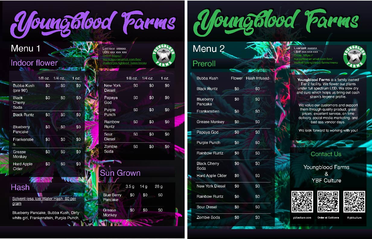
The primary goal of this menu design was to create a cohesive presentation of the Youngblood Farms plant menu, specifically designed for dispensary purchasers. The menu needed to be clear, professional, and easy to navigate for individuals in the cannabis industry who are making purchasing decisions for their dispensaries. The layout had to reflect the high quality of Youngblood Farms’ products while ensuring that the presentation was easy to read and intuitive, allowing purchasers to quickly find the products they are interested in. This meant balancing functionality with aesthetic appeal to make the menu both informative and visually engaging.
The first step was to understand the distinct elements of Youngblood Farms as a cannabis company and how its values and aesthetics could influence the design. The cannabis brand is rooted in the idea of natural, high-quality products that align with a relaxed yet vibrant lifestyle. This contrasts with the streetwear, bold style of the YBF clothing line. The challenge was to make these two identities work together visually without merging them into one, while making sure that each stood out in its own space.
The menu layout needed to present the two brands in a seamless way, with clear navigation for each. I used a grid structure to organize products by category, with cannabis-related products (such as strains, edibles, and accessories) separated from the YBF clothing line. By keeping the two sections visually distinct but within the same design, I created a fluid navigation experience for the user while maintaining the independence of both brands.

To bridge the cannabis and apparel brands, I focused on color harmonization. The cannabis brand’s visual elements incorporate earthy greens, browns, and subtle yellows, reflecting the natural world and its connection to the earth. For the clothing line, I incorporated bolder colors like black and white, which are more typical of streetwear culture. I chose a dark, muted background for the menu, using deep green accents to tie the two brands together. This kept the cannabis influence present while maintaining the modern, sleek look of the YBF apparel brand.
Typography was another element that needed careful attention. The cannabis brand's messaging is grounded and natural, so I chose a clean, sans-serif font for the menu that evokes clarity and modernity. For the YBF clothing section, I used a bold, angular typeface to evoke the streetwear aesthetic, giving the brand a strong visual impact. The use of contrasting typography helps differentiate between the two brand elements while still creating harmony in the overall design.
After the initial design, I conducted several rounds of testing, gathering feedback from Youngblood Farms to ensure the navigation was smooth and intuitive. Based on the feedback, I refined the layout and made minor tweaks to color contrast and font size for better readability. I also optimized the design for different screen sizes, ensuring that the menu would look good and function well on both desktop and mobile devices.