Description
Portfolio Image: Seattle Tattoo Expo Poster
Project Title: Seattle Tattoo Expo Poster
Medium: Adobe Photoshop
Size: 720 × 480 pixels
Timeline: 1 week
Seattle Tattoo Expo Poster Design Submission
Portfolio Image: Seattle Tattoo Expo Poster
Project Title: Seattle Tattoo Expo Poster
Medium: Adobe Photoshop
Size: 720 × 480 pixels
Timeline: 1 week
Seattle Tattoo Expo Poster Design Submission
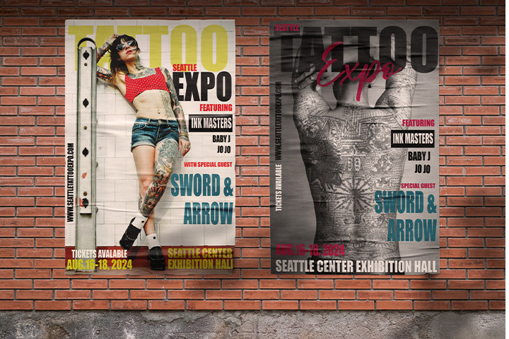
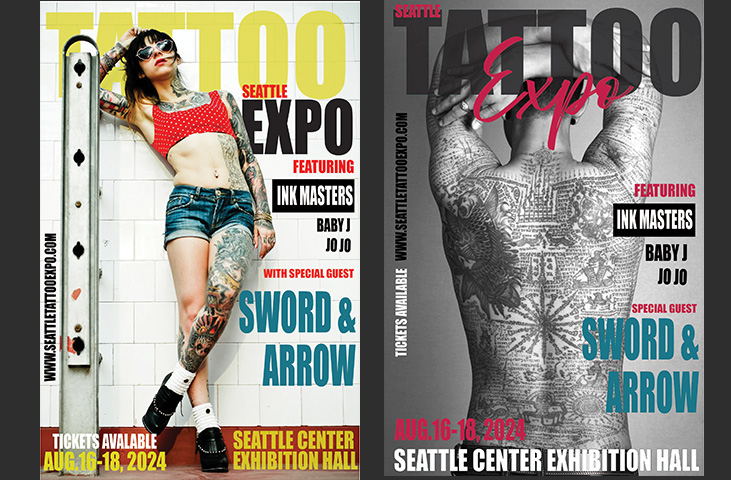
The primary goal of this poster design was to create a bold, engaging visual that communicates the essence of tattoo culture. The design needed to draw attention, generate excitement, and convey the event's unique atmosphere. It was essential to balance creativity with clarity, ensuring that the message and event details were easily readable while maintaining a visually compelling impact.
Understanding the tattoo culture was crucial in shaping the design. Tattoo culture is known for its bold, rebellious nature, creativity, and self-expression. The design needed to reflect these values, while also being visually memorable and engaging. The goal was to strike a balance between the raw, artistic elements of tattoos and the event's need for clear communication.
To create a cohesive design, I incorporated tattoo-inspired imagery. These elements wee combined with bold typography and vibrant colors to create an intense, energetic look. The contrast between black-and-white imagery and bold accents helped highlight the rebellious nature of tattoo culture while ensuring the design was vibrant and attention-grabbing.
The layout needed to showcase the dynamic imagery in a way that was visually engaging but still easy to navigate. I used a grid structure to organize the elements, ensuring that the event details stood out clearly while the imagery remained bold and prominent. The design's structure created a visual flow, guiding the viewer’s eye from the event name to the details without overwhelming them.

Typography played a significant role in conveying the bold, edgy spirit of the event. I chose strong, angular fonts that evoke the rebellious and artistic nature of tattoo culture. The typeface needed to stand out, complementing the imagery without competing with it. The combination of large, bold fonts with smaller, supporting text helped ensure that the poster's message was clear and easy to understand.