Designing the Art Of Anime
Every creative project begins with a vision. For The Art of Anime, that vision was to capture the intricate beauty, dynamic energy, and emotional depth that defines anime culture. Starting with just an idea and a desire to celebrate this beloved art form, I set out to create a book cover that would speak to anime enthusiasts and art lovers alike.
Goal of the Design
As a designer, the goal of creating the book cover for The Art of Anime was to visually encapsulate the essence of anime as a vibrant and transformative art form. The cover needed to:
- Capture Attention: Stand out on shelves or digital platforms with a compelling and dynamic design that immediately communicates the book's focus.
- Reflect the Content: Represent the diversity, creativity, and emotional depth found in anime, while appealing to both seasoned fans and curious newcomers.
- Balance Aesthetics and Functionality: Ensure the design is not only visually stunning but also practical, with typography and imagery that make the title and purpose clear at a glance.
- Appeal to the Audience: Use bold colors, intricate patterns, and anime-inspired imagery to resonate with fans of the genre and invite them into the experience the book offers.
Research and Discovery
The foundation of this project was understanding anime's cultural essence. I immersed myself in the genre, studying its visual motifs, color palettes, and the storytelling elements that resonate most with its audience. I also explored book covers within the anime and art genres to identify trends and areas for innovation.
This research revealed key themes to highlight:
- Vibrant, layered imagery: Conveying movement and emotion.
- Bold yet harmonious color schemes: Reflecting anime's diverse tones.
- Typography: Blending traditional Japanese influences with modern aesthetics.
With these insights, I began conceptualizing a design that would do justice to the rich narrative of anime.
Harmonizing the Visual Elements
To create a cohesive design, I harmonized visual elements by carefully balancing the imagery, typography, and color scheme. The bold, dynamic colors work with the layered illustrations to draw attention, while the typography complements the visuals by providing clarity and contrast. This balance ensures that each element supports the others, creating a unified and engaging cover that reflects the energy and storytelling of anime.
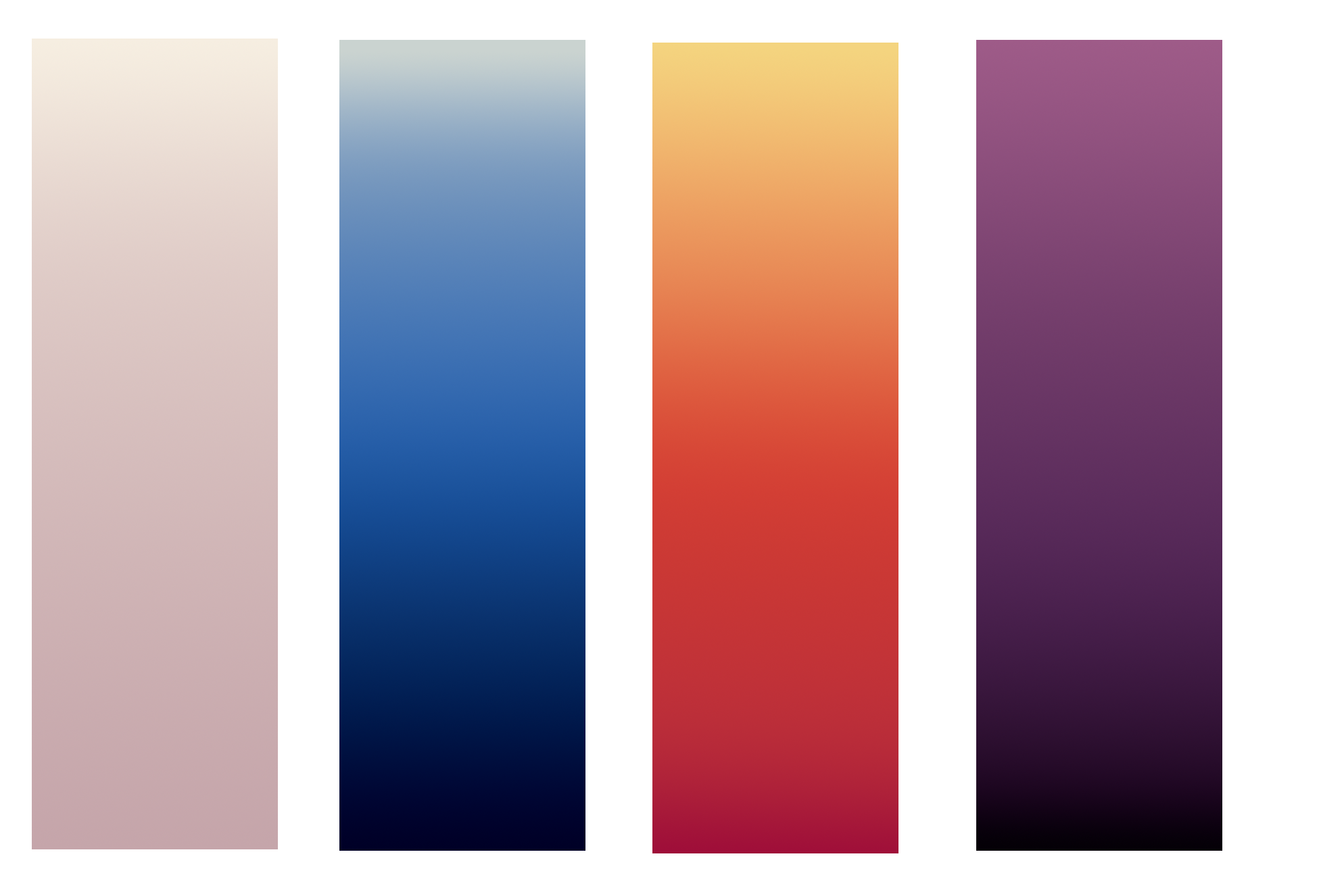
Unified Layout Through Color
A vibrant palette was chosen to reflect anime’s dynamic energy and emotional depth. Primary colors highlight key elements, while secondary tones provide contrast and depth. Neutral backgrounds ensure balance, letting the vibrant accents stand out. This consistent use of color creates harmony and guides the viewer’s eye effortlessly across the design..
Typography and Visual Impact
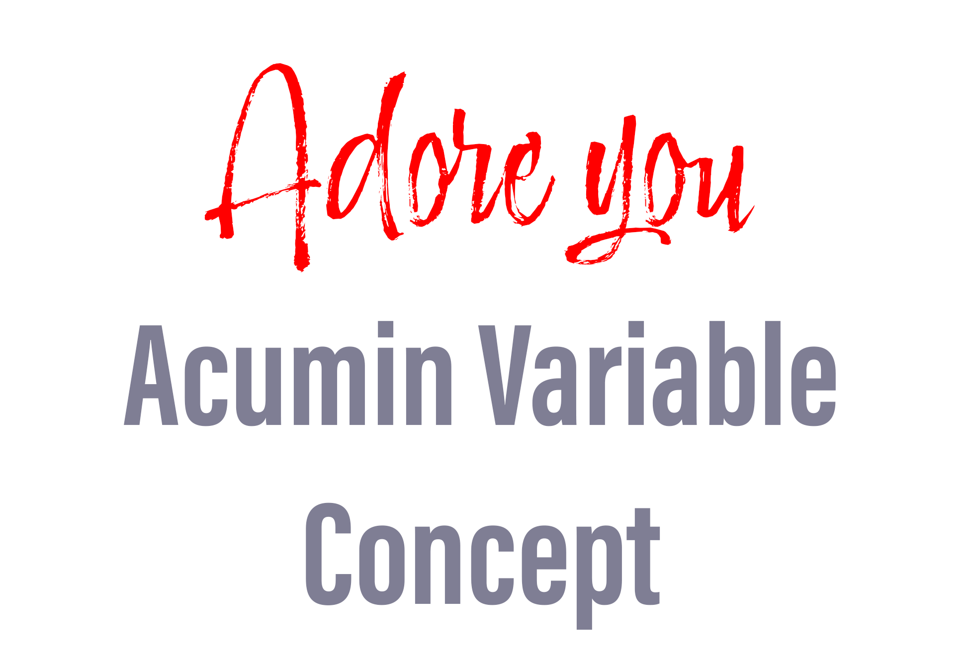
I used Acumin Variable Concept for the main title to provide a clean, modern look with strong legibility. For the subtitle or author's name, Adore You was used to add a playful, expressive contrast. Together, these typefaces balance professionalism and creativity, capturing the dynamic energy of anime.