Ink & Bloom Permanent Make-up Artistry:
Building the brand from the ground up.
Every successful business begins with a dream—a vision of something unique, something personal, waiting to be brought to life. For Ink & Bloom, that dream was a permanent makeup artistry studio, full of potential but without a clear identity.
Turning a Dream into a Brand
When the founder approached me, she had nothing more than her passion for the craft and a name that hinted at growth and transformation. There was no branding, no color scheme, no promotional materials—just an idea and a willingness to let creativity lead the way.
This project wasn’t just about designing a logo or choosing fonts; it was about creating a brand that could grow with her vision, reflect her artistry, and connect with her future clients. With full creative freedom, I set out to build Ink & Bloom from the ground up, transforming a simple dream into a cohesive, professional identity.
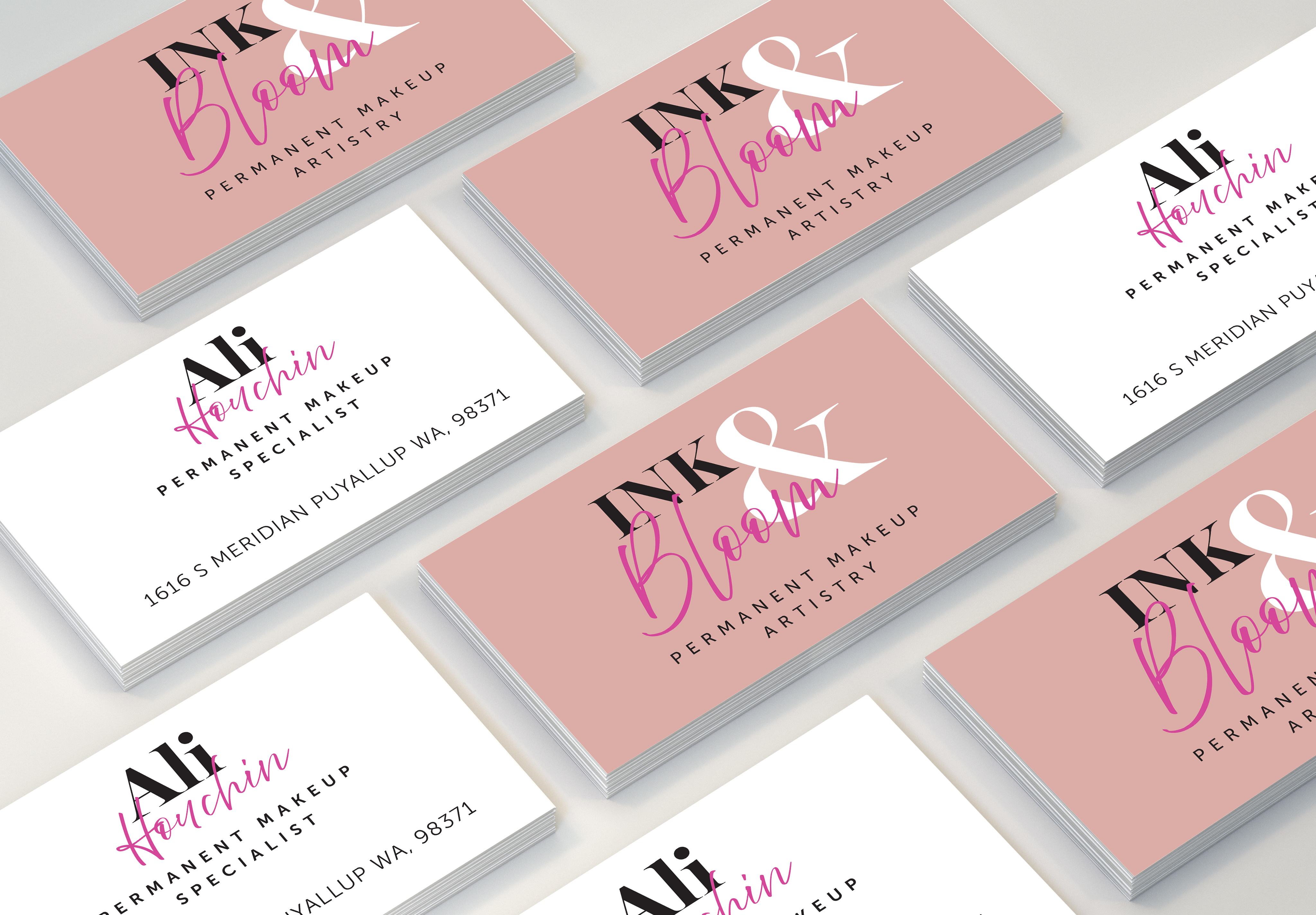
Research, Discovery and a Business card
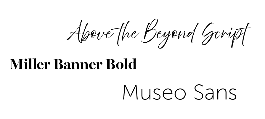
Our journey began with a bit of research and discovery. I explored the world of permanent makeup, identifying themes, styles, and colors that resonated with the essence of beauty and transformation. With this foundation, I designed her first business card—a small but powerful step in defining her brand.
The business card became more than just a piece of stationery; it set the tone for everything that followed. Its clean design, thoughtful color scheme, and elegant typography served as the foundation for In Bloom’s visual identity. From there, the process unfolded naturally, evolving into a cohesive brand that embodied her artistry and professionalism..

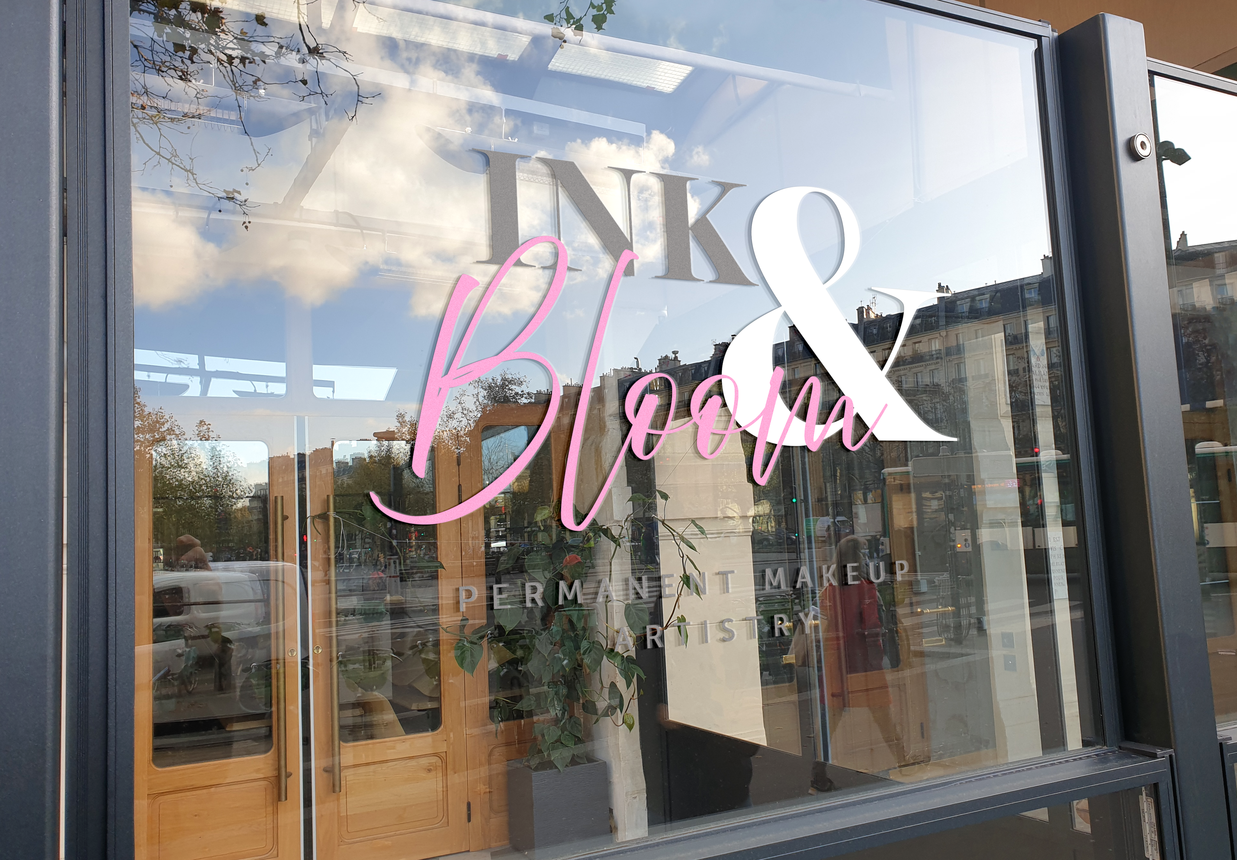
Expanding the Vision: Bringing the Brand to Life
With the business card and color palette in place, the foundation of In Bloom’s brand identity was set. These initial elements were more than just designs—they were the visual language of her dream. From here, it was time to expand the brand and create materials that would not only represent her business but also engage her clients and build trust in her artistry.
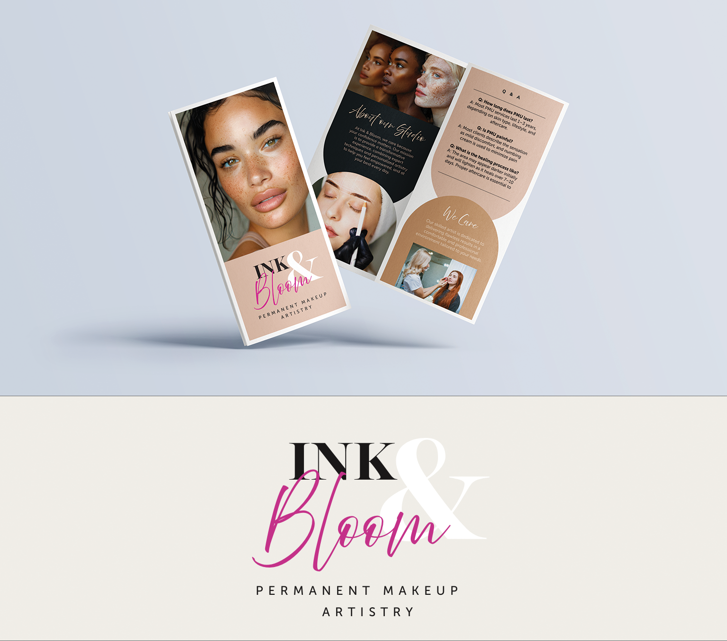
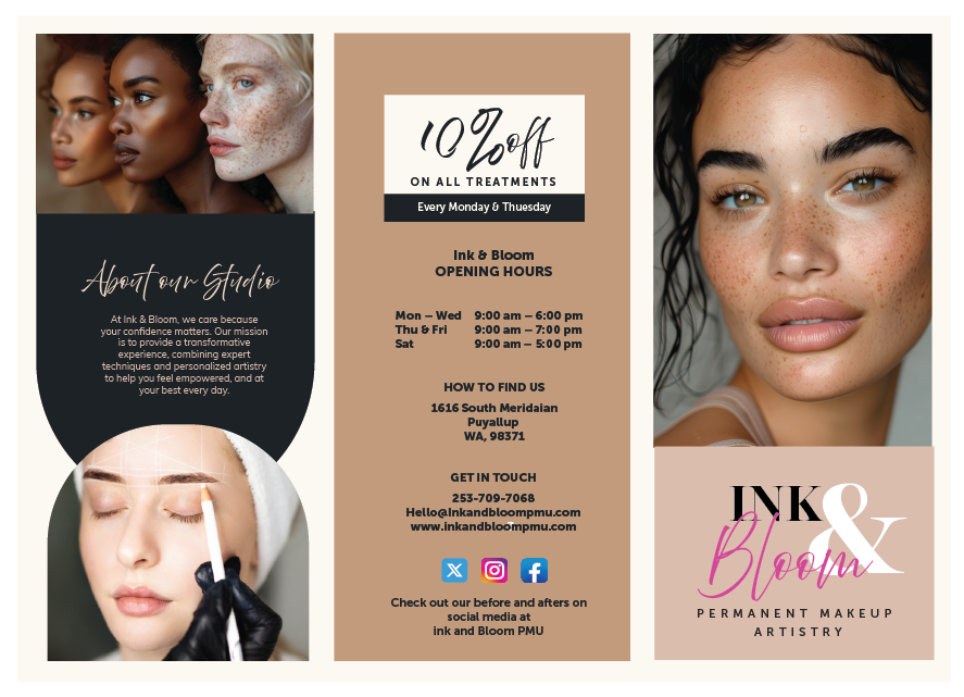
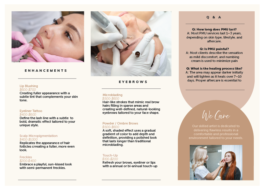
Ink & Bloom Brochure
The brochure for Ink & Bloom was crafted to serve as a key marketing tool that effectively communicates the brand’s identity while providing potential clients with essential information.
The design aligns with the established visual identity, using the chosen color palette, typography, and imagery to create a cohesive, professional look that reflects the brand’s elegance and expertise. The brochure not only serves as an informative guide but also strengthens the brand's presence by making a lasting visual impression.
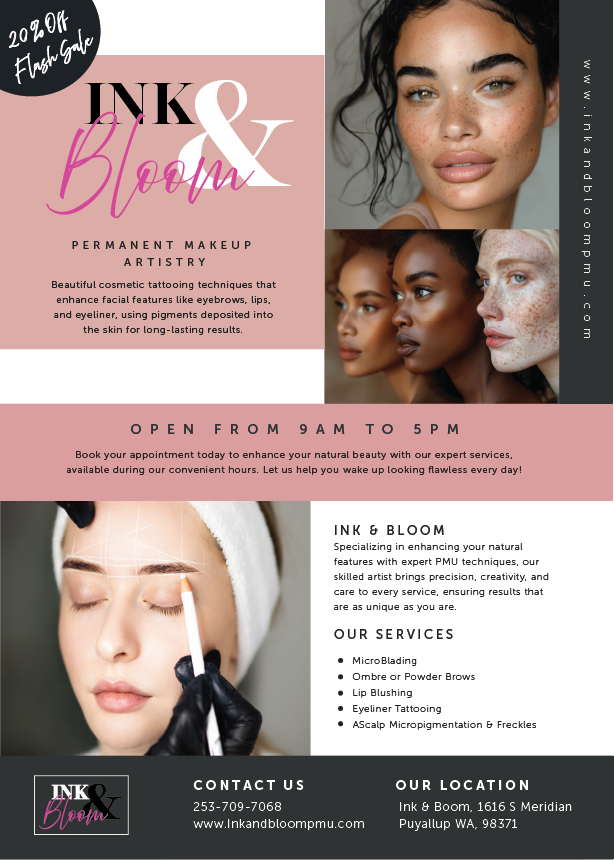
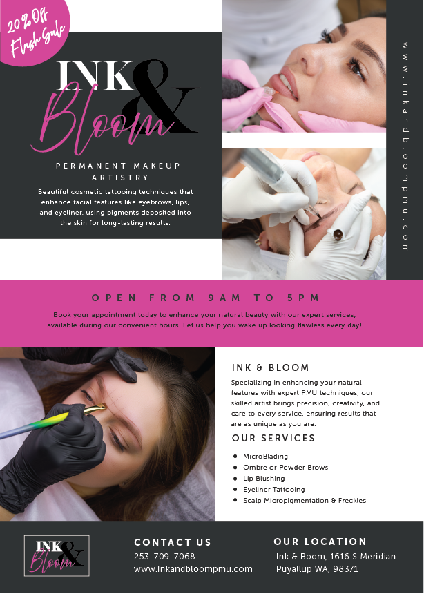
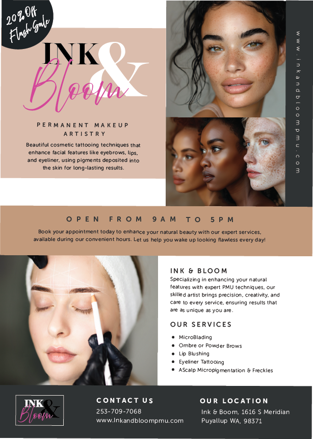
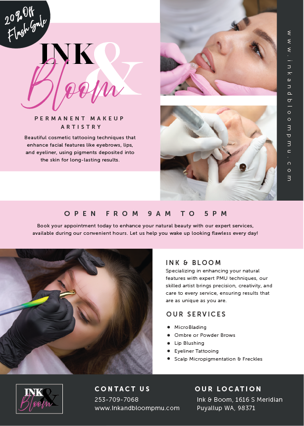
Ink & Bloom Promotional Flyers
The promotional flyers for Ink & Bloom were designed to keep clients informed about seasonal offers and services. Each flyer aligns with the brand’s visual identity, featuring the established color palette, typography, and imagery. These flyers serve as key marketing tools, ensuring consistent communication and engagement throughout the year..
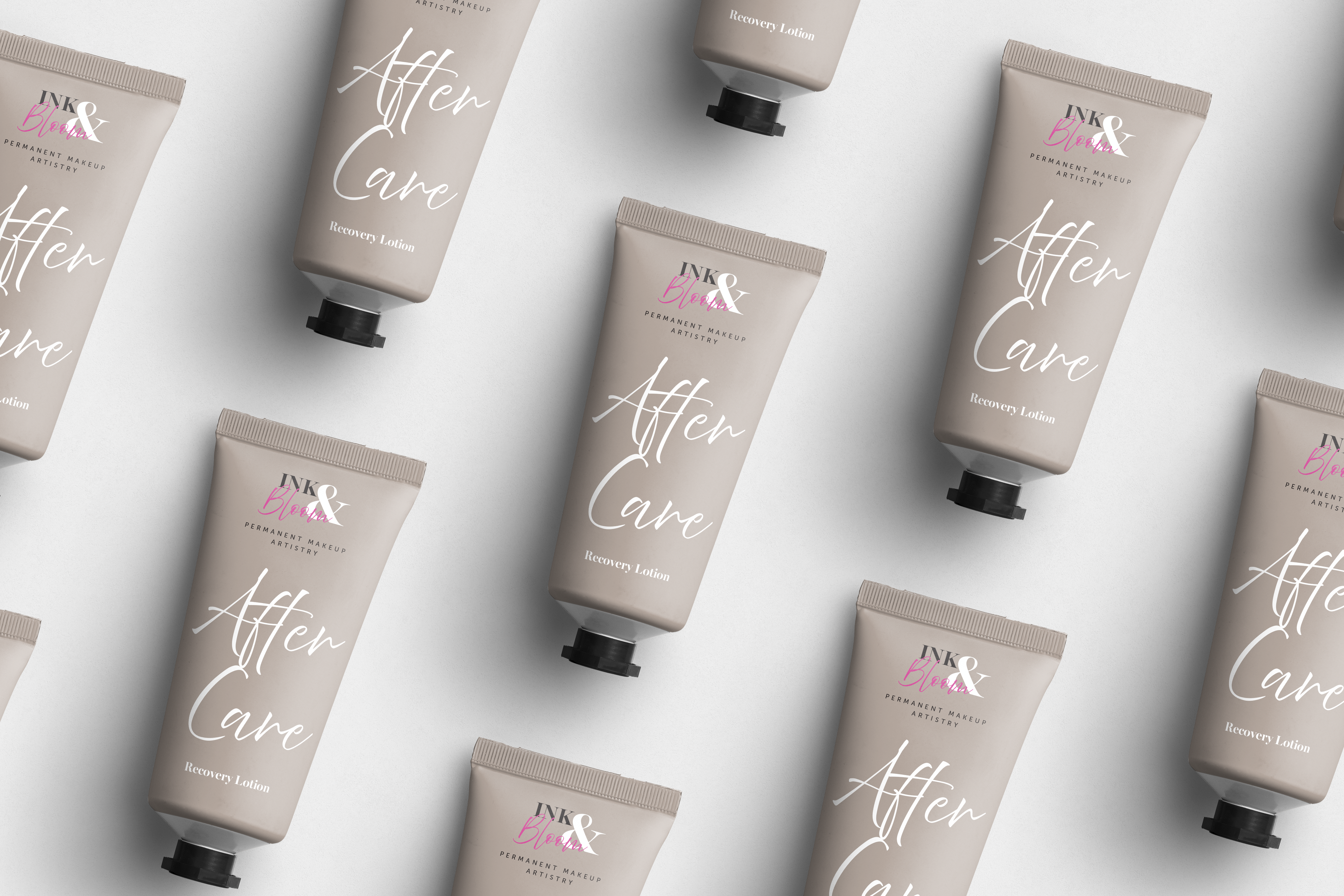
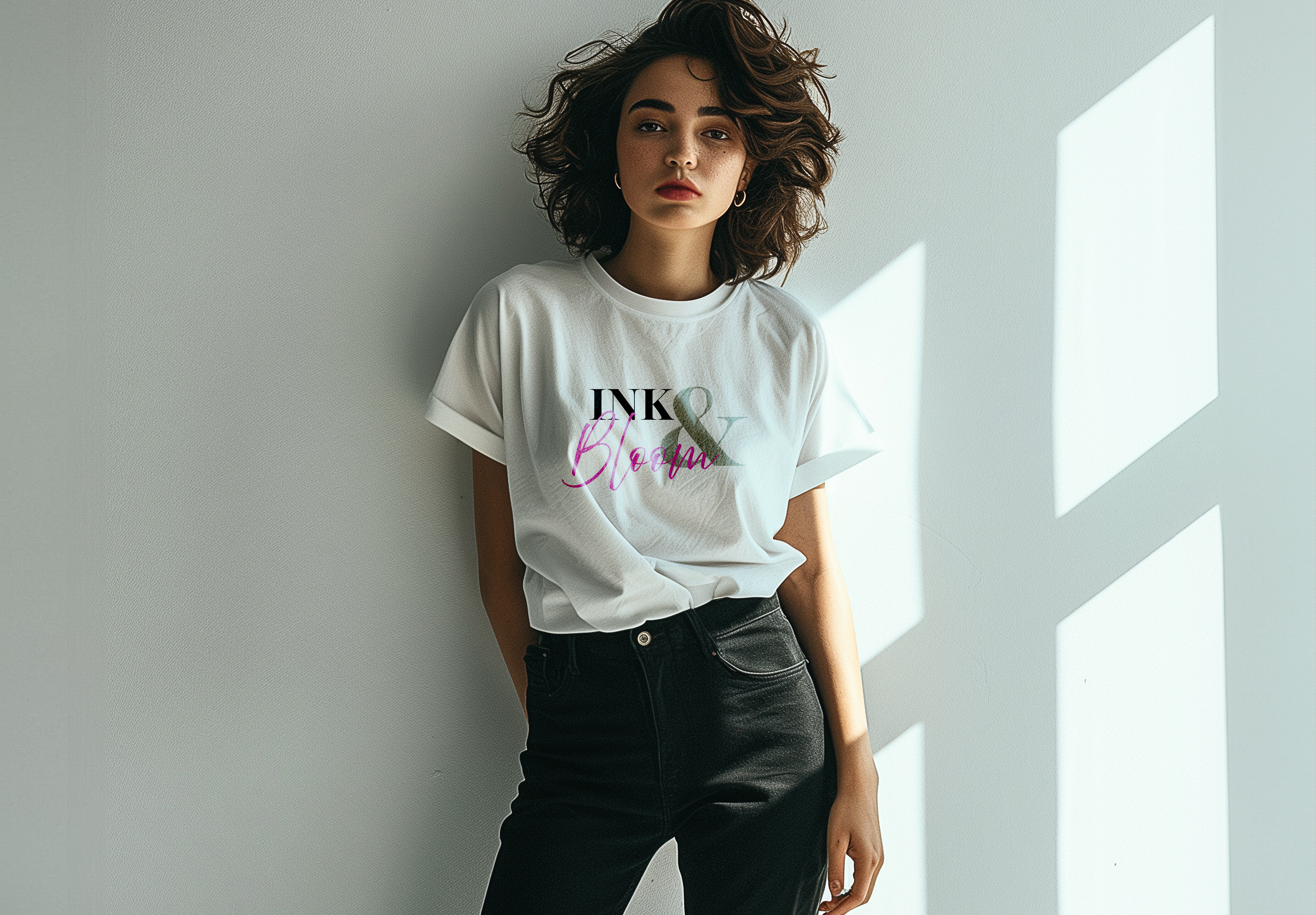
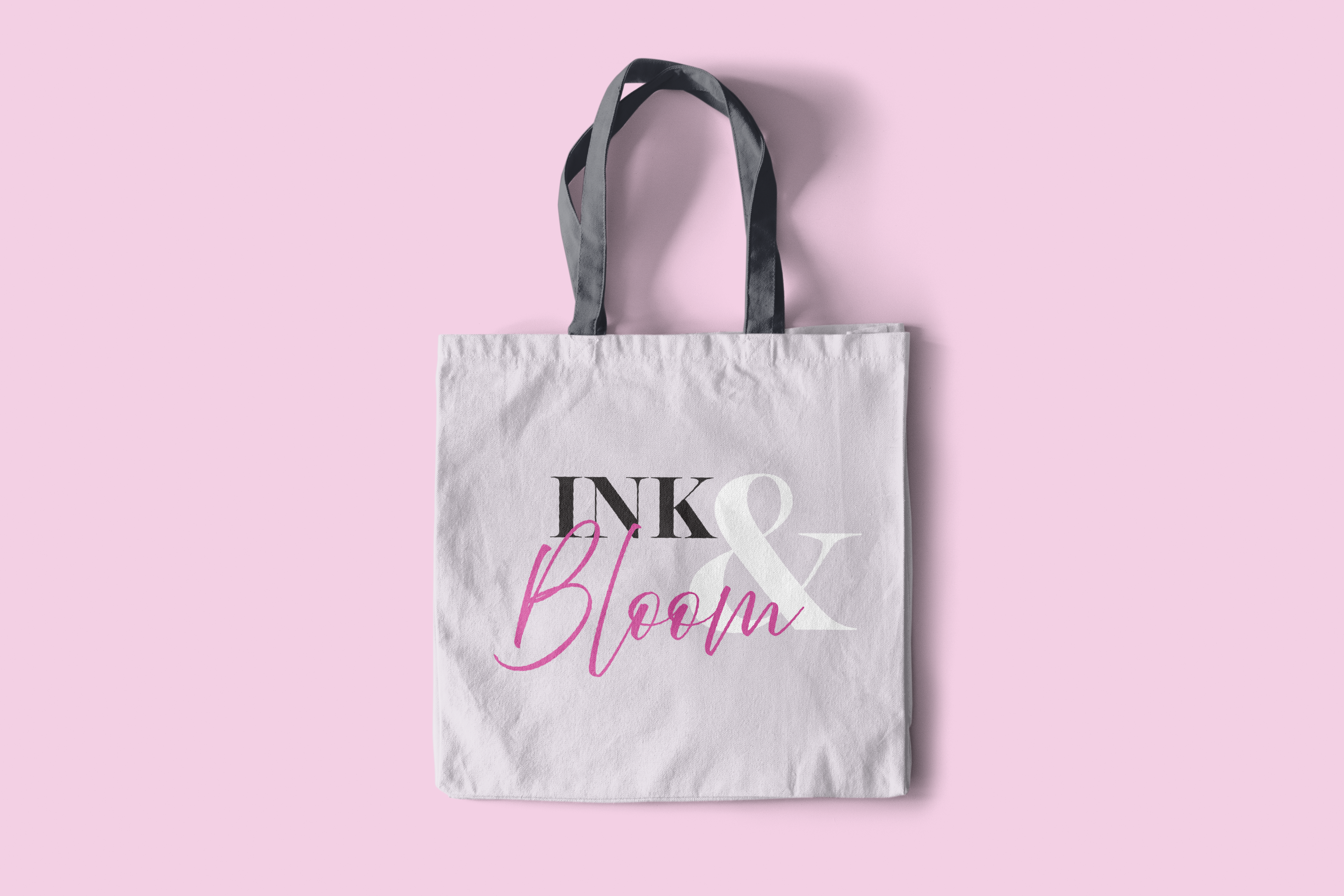
Ink & Bloom Products
Ink & Bloom’s product line includes T-shirts, bags, and recovery lotion for employees and clients. These branded items featured a logo on each product to promote the brand and enhance the client experience.
The Really Awesome Part
Working with my client to create graphic design work for Ink & Bloom was an incredibly rewarding experience. Seeing how the brand identity I developed truly resonated with her was the best part. As a first-time business owner, she initially felt uncertain about the direction she wanted to take. However, once we crafted a clear and cohesive brand, she felt empowered and confident. The new brand not only helped her define her business image but also provided a framework she didn’t realize she needed. It was fulfilling to watch her gain the clarity and confidence to confidently move forward with her vision
"Working with Shay was a game-changer for my business. As a first-time business owner, I didn’t know where to begin with creating a brand identity. Shay not only brought my vision to life but gave me a framework I didn’t even know I needed. Thanks to her expertise, my brand now feels complete, and I’m confident it represents who I am and what I stand for."
– Ali Houchin, Owner of Ink & Bloom